Game Adaptation: Atlantis Map

To create more of a visual understanding of my game adaptation we were tasked with creating maps that show the world and different features of our game.

The first map that I created showed the layout of the Atlantis city. So that I had a starting point I looked at maps used in other games. I found that the best examples were from MMORPGS as they usually have a large world. I gained a lot of inspiration from the map of Bree from Lord Of The Rings Online. I knew that I wanted to have two large temples which I previously created in my early concepts and a dock as well so that there was some way of getting to the island. I started the path from the dock randomly drawing, making sure that the path didn’t look straight as I felt like this would be too plain and look out of place. Eventually, I came up with a path as well as a town center. This then allowed me to add the buildings, lake, and parks around the city, filling it up so that it didn’t appear as empty.

So that the map had a use I decided to create a key that had symbols representing things such as quests and merchants. I then placed these symbols randomly throughout the buildings so that the city had a purpose.

Since this is only a sketch I feel like if I were to add a bit of colour it could improve the design and add to the visual. This is only one of three maps that I want to create as I feel like there needs to be another city map of the beginning town, and a world map so the player knows the size of the environment.

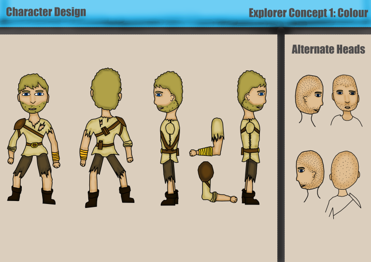
Character Design: Explorer Concept 1 (Coloured)

Just like my other design I also added color to the first set of sketches that I created. I used similar colors to the other design so that the style of clothing was the same and possibly so that it could be a damaged version of that outfit. I went with gold for the buckle and the bracer so that it would stand out and look like the only piece of value on him.

N reflection to this design I feel like the colors I have used work well and give a time set for the character. The only part of the design that I am not happy with is the beard of the main character as I feel like it doesn’t fit in. With further practice, I think I can find a way to get past this issue.

character-design-sheet-1-colour

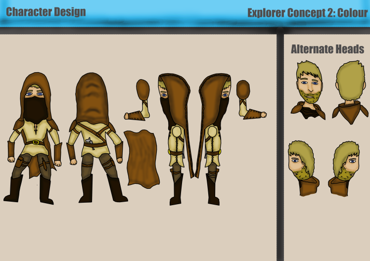
Character Design: Explorer Concept 2 (Coloured)

With the sketches from the second concept sheet I then added color onto it in photoshop. I first re-drew it saw that the lines were more defined and clearly visible. I then began to add color. I made the character himself have a blonde hair color he is unique as more characters usually have brown hair, I also did this to contrast with the other colors that I would be using. These colors are mainly browns so that the armor and cloak look as if they are made from leather, and a light orange so that the tunic looks like it has not been cleaned and has faded in the sunlight.

In reflection to this, I feel like this design works really well and the colors that I have used add more depth to the character and show what his clothes are made out of. The only negative about this is that the character looks more animated which is only because it is concept art. When I come to creating the character in a realistic scale it may have fixed this. Next, I will do the same process to the other design so that I have more outcomes and more choices for the final design.

character-design-sheet-2-colour

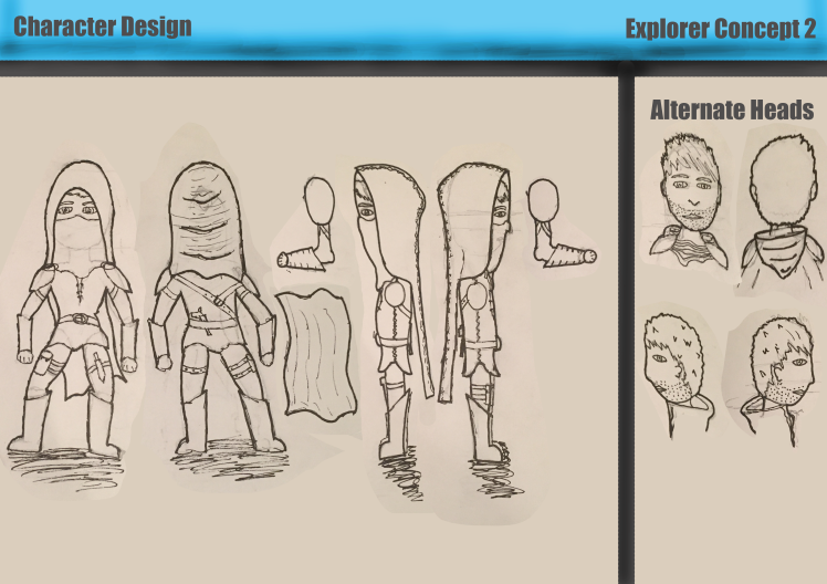
Character Design: Explorer Concept 2

After I finished the first design I wanted to create an alternate design inspired even more by the character from Thief. Since I want my character to be mysterious and little is known about him at the beginning of the game it would make seen that a lot of him is covered. Therefore he had a hood, alternate designs showing the hood down, and a bandanna to cover his face.

I wanted to make it so that some of this design was similar to the last one. For example the shoulder pad and the tunic. This means I could use both of the designs within the game and use it so that the design changes in the game because of an event or at a certain point.Just like my previous concept I organized all the sketches into a design sheet so that it is easily visible.

In reflection to this, I feel like this is a good start on this design and by having a hood and bandanna it reduces the likeliness of a disproportionate face. On the other hand, by creating an alternate face it helps me to increase this skill and also gives me more choices. My next steps will be to add color to this design in photoshop to bring the character to life and add more detail.

character-design-sheet-2


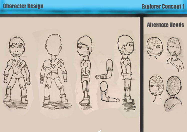
Character Design: Explorer Concept Sheet 1

With the inspiration that I had gained from my research, I began to draw up some different characters. Firstly I decided t go with the animated abnormal body shape that doesn’t rely on correct proportions. I wanted the character to be wearing the typical medieval clothes will having scratches and rips on his clothing. As well as this I still wanted the character to have some form of protection since they will be traveling to dangerous places. Therefore I decided to give the character a shoulder pad that would be held on by a strap attached to the characters built. Finally, I added pouches to the characters built since he is an explorer it is likely that he will want a place to store the artifacts that he collects.

To show the full visual of this concept I created a full rotation showing all four sides of the character. As well as this I also created an alternate head for the character which can show a whole different personality to the character and give them more of a clean and simple look. I showed all of these drawings by creating a character sheet on A3 in photoshop. Making it clearly visible which were the alternate heads and which was the main part of the concept.

Looking back at this work I am proud of the outcome of this design, however, I need to carry on with this body type, experimenting with different clothes to give me more options for the character. As well as this  also want to take this designs and apply them t a realistic human and see if that would be better or worse for my game.

character-design-sheet-1

Game Adaptation: Robot Pareidolia

Even though I had already created four different designs for the robot I wanted to continue to explore different designs to come up with a unique looking design. I did this by using the parabolic method which gave me unique shapes for the robot that I wouldn’t have thought of without pareidolia.

After this was done I then took two of the characters and developed them further by creating alternate designs. I did this for the bug looking robot and the tank looking robot. I gave them all unique designs that gave a different theme for the game.

My favorite of the designs was the bug-like the robot which had an art deco style engraving on its panels. The robot was one of the unique designs that I came up with and is unlike anything I have previously seen in other games or movies.

To reflect on this I feel like I now need to take this design further in photoshop by making different variants of the robot that gave it a different role. For example, one would be a soldier while another would look like a medical robot.


Robot Concept: Design 3

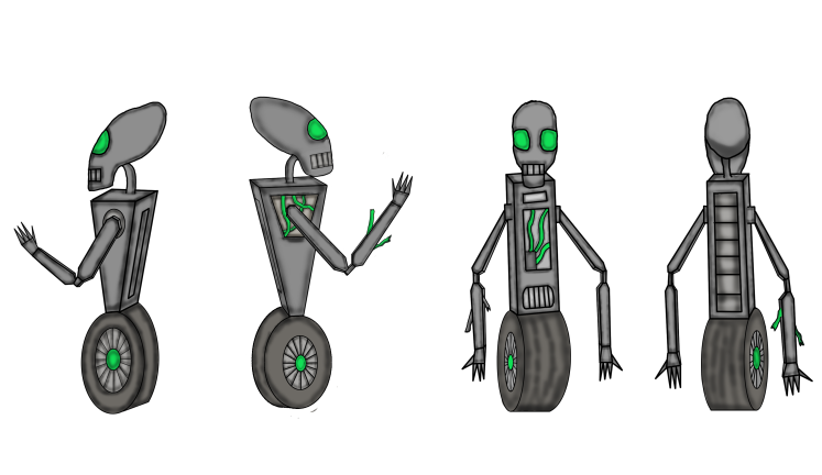
After finishing both of the robots I decided to do a second texture variant of them which would change the theme of the robot. I decided to go for the grey texture to make it look more like a modern more armoured metal. To go with this I changed the colour of the eyes and cables to a bright green so that it appeared futuristic and as if the cables were acting more like tubing for fluid.

I felt like this design works well with the robot in making it look more lethal and armoured however it goes away from the fantasy ancient feel as if the robots has been there for centuries. This robot could be used in a future project or possibly even as a guard within the prison game as that has a sci-fi theme however the first concept works better for this project

robot-3

Robot Concept: Design 2

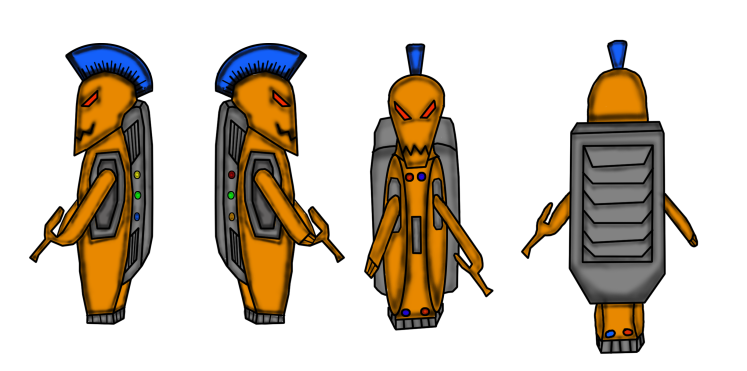
After the first concept was finished I then began to recreate the second design in Photoshop. I decided to use the same color palette with this design as I wanted it to look like armor, especially the head as if it had been made from an old helmet from the armory. To make this more apparent I decided to edit the design by adding the crest which is commonly seen on lots of ancient warrior helmets. In this design, I decided to make it bright blue as I felt like this would be the military color since they are guarding an underwater city. Since the backpack/battery pack will have to be the most armored part of the robot I used a gray color to show that it is made from a stronger metal.

I will also do an alternate design of this which will use different colors to achieve a more modern look while still paying homage to the ancient robots.

When looking back at this design I can see things which I could be improved and some things I am glad I changed such as having the crest rather than the antennas. If I were to redesign this robot I may make it have more detail such as exposed cables and damage that it has acquired from previous battles. Similar to the first design.

robot-2

Robot Concept: Design 1

After I had finished drawing a few different designs I decided to recreate them in Photoshop and add colour so that they appeared more lifelike. The way I planned in doing this is by having 2 robot designs which I will then create 2 different texture designs for.

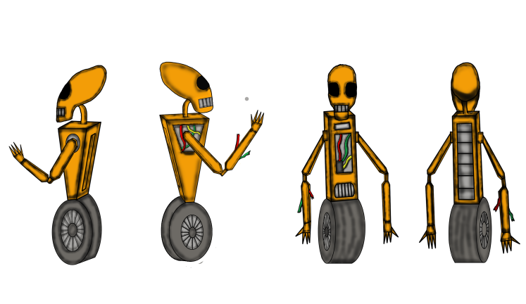
The first design is for the robot inspired by claptrap. I wanted to use oranges and browns to appear as the robot is made from scrap metal and is ancient as better materials would not be available. I decided to g the typical red,green, and yellow cables so that they are easily visible to the viewer and shows how damaged the robot has become over the years.

In reflection to this design, I feel like the colours I have used work very well and help show the theme and time set of the robot. If I were to take this design back into Photoshop I may try to improve the amount of detail on the robot and try to add highlights to the character to show where the light is coming from.

robot.png